Both Apple and Google have released aggregated and anonymized “mobility” data to help public health officials set policies around COVID-19. It is no secret that both companies possess significant detail about the physical movement of their customers. Naturally, they are in a great position to share data on how the virus may be spreading. I applaud the effort in releasing this data. Unfortunately, I am noticing a disappointing trend - the data has frequently been misunderstood and misused.
The public health officials are not entirely at fault here because although the datasets are helpful, they are not perfect. In an attempt to avoid any privacy concerns and protect commercial interests, both Apple and Google have gone to great lengths to obfuscate the data making it less useful.
While many parts of the United States and Canada are starting to get COVID-19 case numbers under control, my home of Ontario, Canada (with over 14 million people) is struggling. I will provide an example where the newly adopted mobility data analyzed by my local government is not clear. I will also share this with them in the hopes that they improve their analysis and communication going forward.
While reading this article, please know that I greatly appreciate the efforts of all of the hardworking people involved. The analysts, professionals, doctors, nurses, and front-line works are there to help keep us safe. Please follow the information, resources and advice from your local public health agency. I have followed and will continue to follow all instructions provided and I hope that you do the same.
The Updated Models
My local government has been providing regular updates around how they set policies related to COVID-19. As a citizen, I appreciate this disclosure and transparency. One of these updates was presented publicly yesterday by my local “COVID-19 Science Advisory Table” and included their updated modeling.
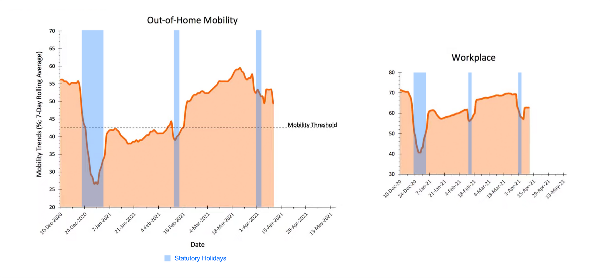
The Apple and Google data was used to explain the cause of the increase in COVID-19 cases and hospitalizations. Accompanying this presentation, was a declaration of state-of-emergency and stay-at-home order.
Here is the excerpt from the presentation on mobility data:
Problems with this analysis
Both Apple and Google provide raw mobility data therefore I have been able to attempt to recreate the charts provided. (The public health official did not state that data came from any other sources.) In doing so, I have noticed two main areas of concern:
1. Not understanding the “baseline” and not normalizing the data effectively
Instead of providing total number of visitors to each location category over time, Apple and Google normalize the data against a "baseline." While Apple's data is less detailed, both Apple and Google provide an explanation of what that baseline is. To summarize it here for you, the baseline data is effectively from January 2020. This means that all of the raw data at each date is a percentage difference from January 2020.
Google provides clear guidance on how to read this data, and what should and shouldn’t be inferred from it. Google even has a checklist called "Calibrate your region" which it is clear that this analysis did not follow.
"These baseline days also don't account for seasonality. For example, visitors to parks typically increase as the weather improves."
In January, the weather in my area is harsh and it is the coldest month of the year. An average of -5.5°C (22.1°F). People are generally outdoors and visiting parks less often. Comparing mobility data for March and April against a baseline of January without normalization does not seem reasonable. Also, parks have repeatedly been communicated as a safe place to travel outdoors. Should this mobility data be shown separately or have less of an influence? The public health official is not clear on this.
When factoring in the baseline, it may have been useful to further normalize the data for weather, holidays or even weighted by most populous regions. Maybe sprinkle in proprietary and more accurate data sources. At minimum, the public health officials should have stated the assumptions on the slides. To further compound the confusion, the y-axis is not well-defined (% of what?) and the width of the x-axis has a suspiciously short width.
2. The old correlation vs causation problem
It was repeatedly stated that the "public health measures" were leading to reduction in mobility at certain times in history. While it is obvious that reducing mobility and in-person interaction reduces the spread of the virus, I am not sure that the public health measures can take full or even most of the credit for reducing mobility during certain time periods.
The mobility drop-offs in December, February and April seem to be more likely caused by statutory holidays than public health measures. You can also see this is further corroborated by the government's chart for "Workplace" mobility. Citizens would more likely be in residential locations regardless of public health measures because most public locations are closed.

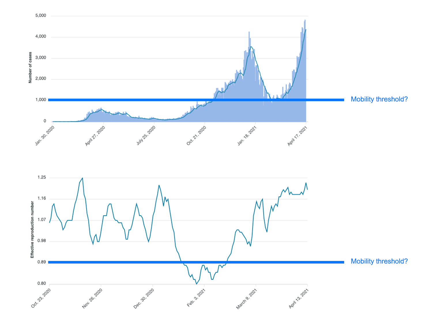
I am also not sure what the "mobility threshold" is and how it was determined. We are told it is the level of mobility that will lead to a reduction in virus spread but where does it come from? The threshold strongly correlates with the lowest new case numbers and lowest effective reproduction number (Re) over the past six months. If this is true then I think there is too much reliance on this correlation. It will be interesting to see if the mobility threshold is hit in the future and whether that results in Re below 1.00.

Data driving decisions
While the data and analysis from advisory groups inform decisions, it seems the policy-makers have the final say. One member of the local advisory group, professor Dr. David Fisman expressed his frustration with certain decisions. He said “The reason it’s so frustrating to hear stuff like this is [leadership]’s got the science absolutely upside-down,” and called the decision to restrict outdoor activities “absolute madness”.
Maybe if the data was better analyzed and presented, the policy-makers would make better decisions. It is also important to note that I have come to similar conclusions - there is an increase in mobility since January 2021. We should all aim to reduce this and do our part. While the conclusions are similar, I am disappointed by the level of analysis shared (and also by the local restrictions placed on outdoor activities).
I tend to have a Game-Theoretic perspective on the spread of COVID-19. Regardless of stricter public health measures, the few who don't follow the general guidelines will contribute to the spread and make it continuously difficult for the majority to endure. Fortunately, vaccine rollouts are well underway.
Disclaimer: The opinions presented are my own and do not reflect those of my partners or my employer.
Unmodified charts If you want to see what the mobility data from Google actually looks like, see below. This is the raw data from where I live (Ontario, Canada) and is unmodified. I also copied how Google charts the data in their official PDF reports.